Blink Fitness Gym

Has a mission to change lives and improve the quality of the communities they serve. This project aimed to enhance the gym experience by introducing a new feature called BlinkBuddy, which facilitated the matching of gym-goers with similar workout interests and schedules, it addressed the need for members to connect with each other while holding each other accountable for their individual fitness goals.

ABOUT BLINK BUDDY

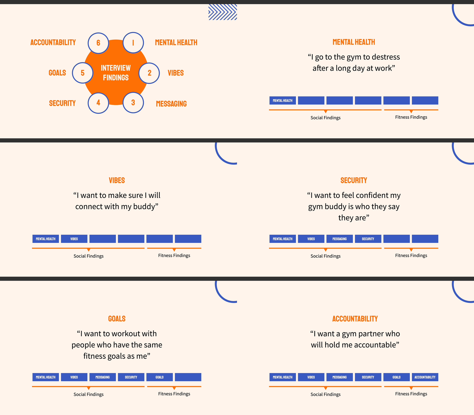
Our UX/UI team conducted extensive research, combining user interviews, and observation studies to gain valuable insights into the needs and preferences of BlinkFitness members. We discovered that many users were interested in finding workout buddies who could help them stay motivated, provide mutual support, and add an element of accountability to their fitness routines.

My role

UX/UI Designer.

Task

Designing a concept social feature.

Timeframe

Two weeks/daily meetings with team members.

Tools

Figma, Google Doc, Trello, Zoom, Slack.

Deliverables

Mobile APP

The scope of the project

This project aimed to enhance the gym experience by introducing a new feature called BlinkBuddy, which facilitated the matching of gym-goers with similar workout interests and schedules, it addressed the need for members to connect with each other while holding each other accountable for their individual fitness goals.

Understanding the target audience

BlinkBuddy targets mostly

Fitness Enthusiasts: Passionate about fitness, these individuals see the gym as more than just a place to work out. BlinkFitness app caters to their desire for a supportive community that fosters personal growth and achievement.

Goal-Oriented Individuals: Driven by specific fitness goals, these users value an app that helps them track progress, stay focused, and reach their milestones. BlinkFitness empowers them to stay accountable and motivated on their individual journeys.

Socially Engaged Users: Embracing the power of connection, these users appreciate networking and building relationships within their gym community. BlinkFitness provides a platform for them to connect, share experiences, and support each other towards success.

I kept all these in mind while I looked for a solution with my team.
Animated GIF

Exploring the competitors

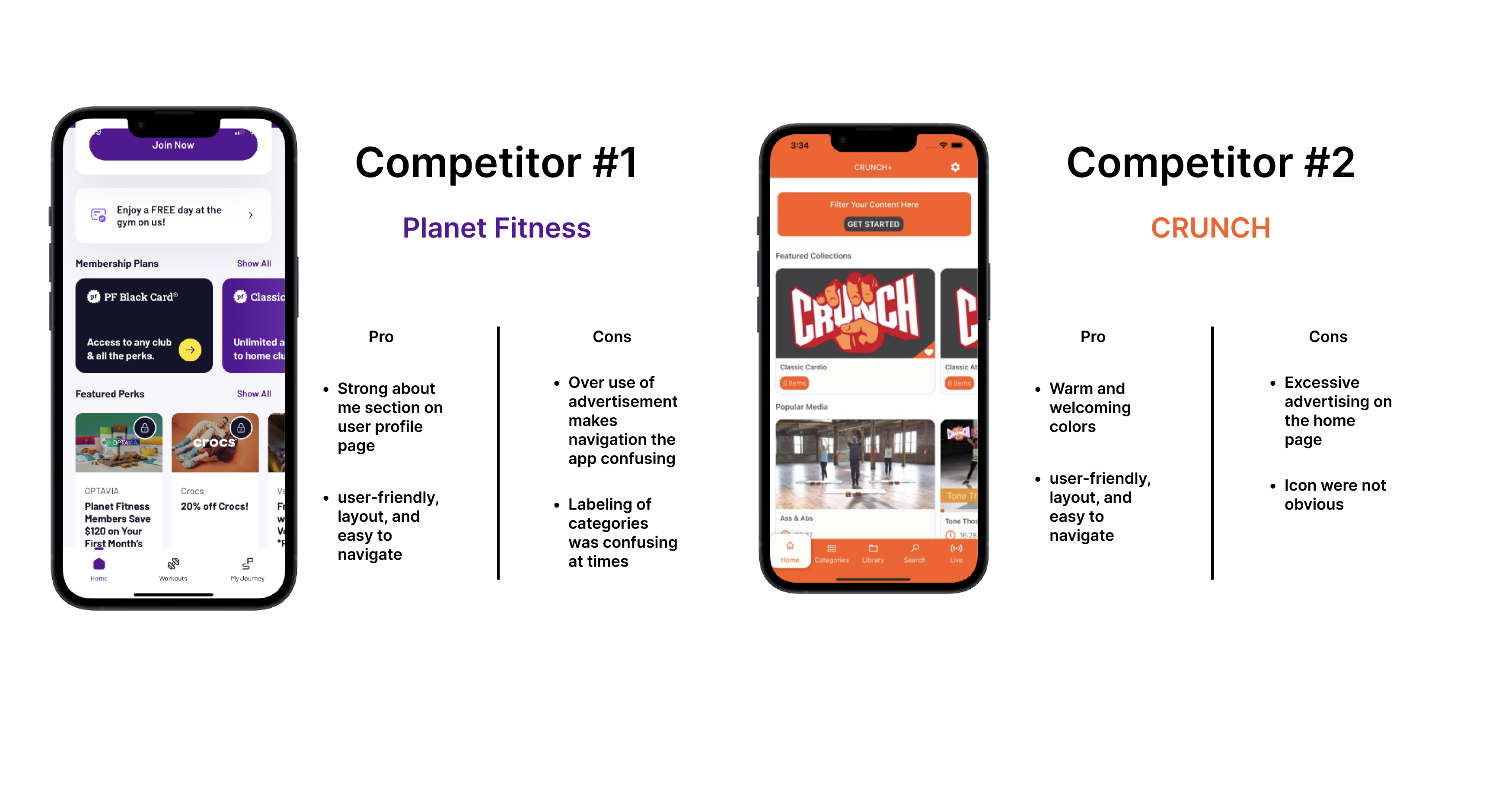
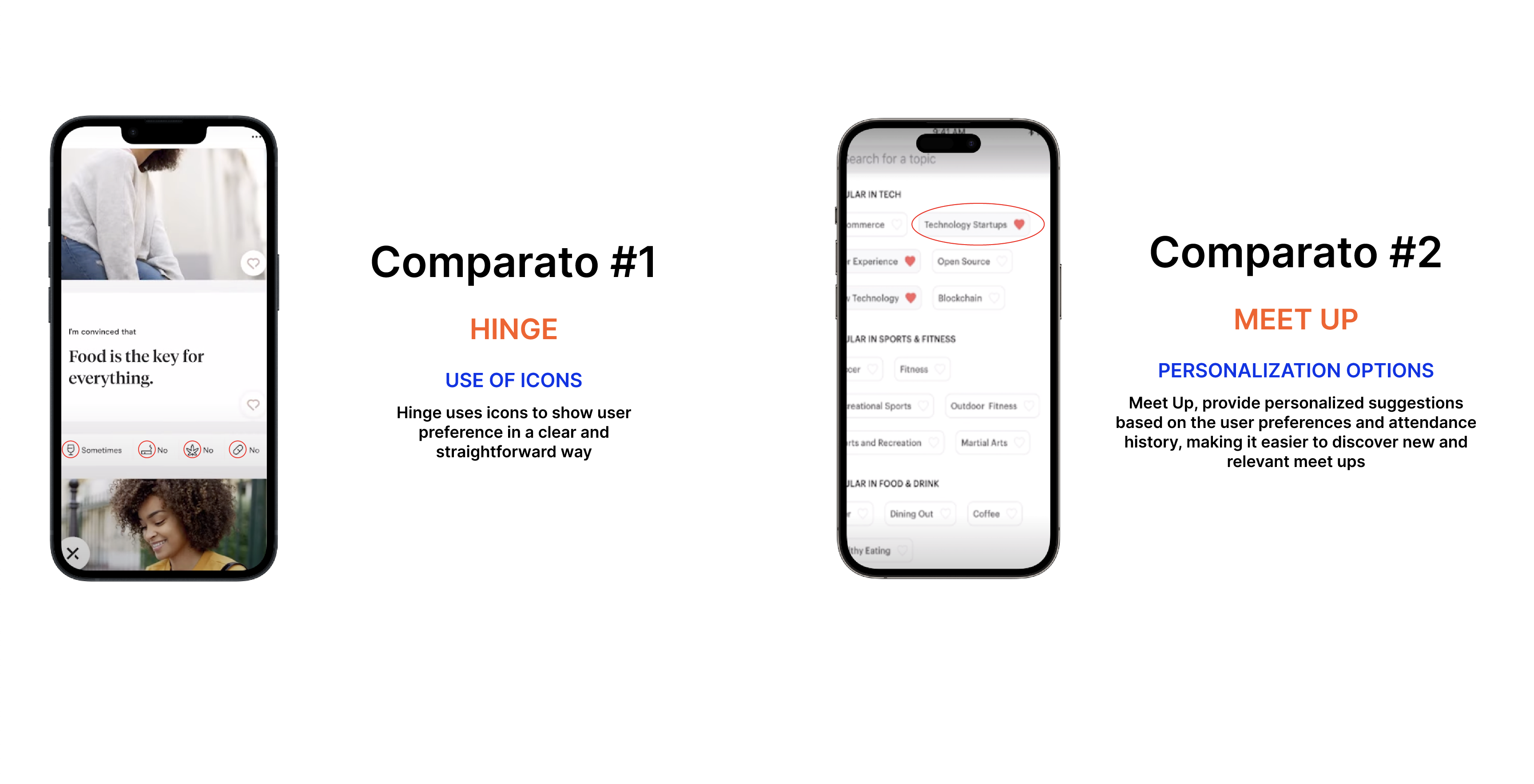
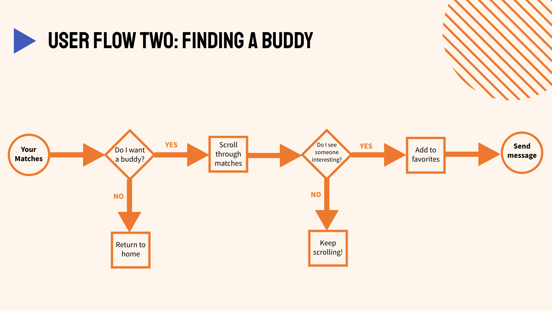
When scoping the competition, we looked for the user's flow when completing a task, what features exist on the market, and their visual language. We also looked for apps that allow the users to personalize their gym experience according to their needs without overloading them with options.

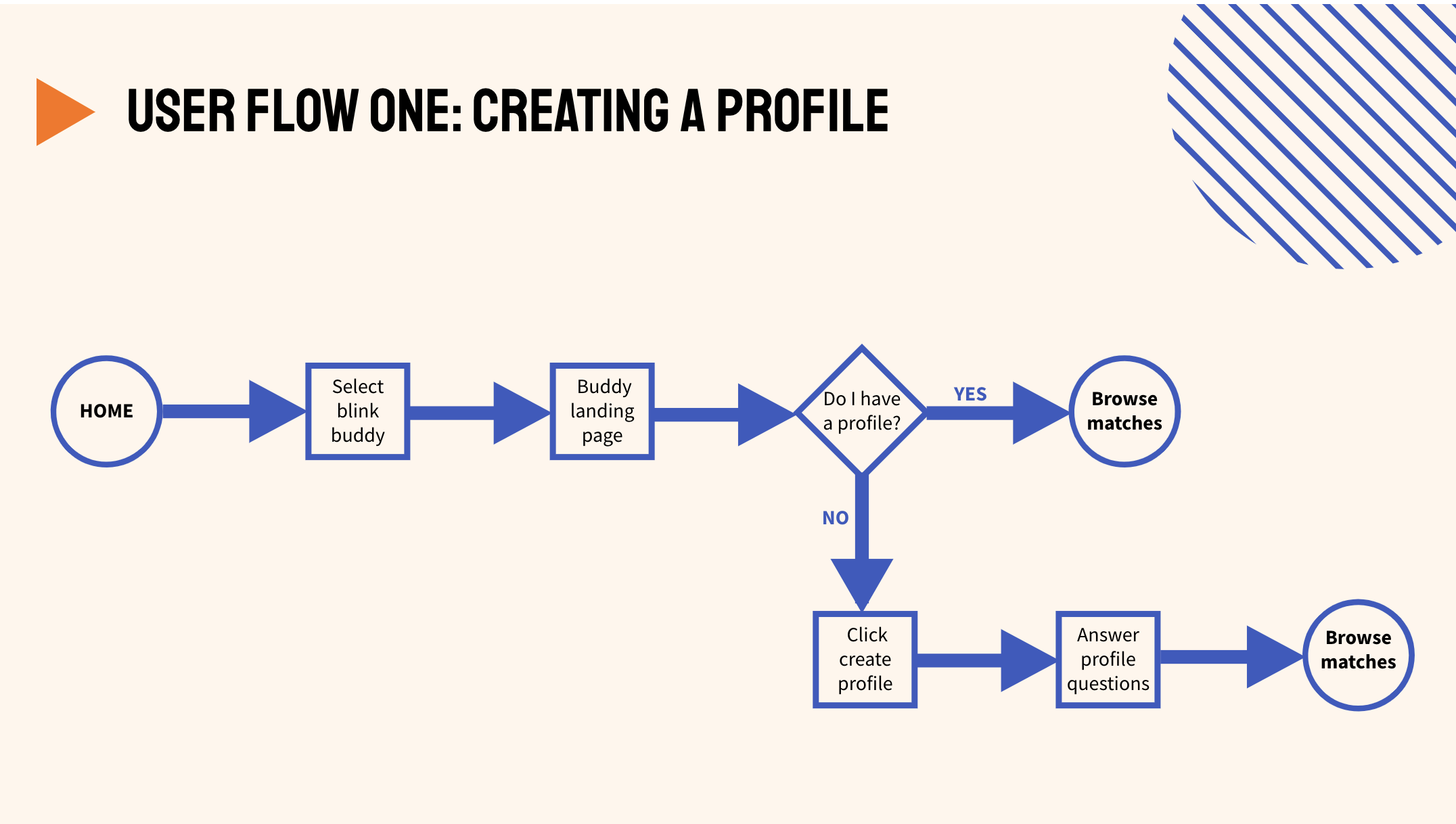
User Flow

Making it our own

The following design principles are based on the combination of findings from competitive analysis, user testing and aligned to our client’s brand principles. These principles influenced our design decisions to explore ideas around a platform that encourages users to choose the best buddies.

Usability testing

  • Profile Creation: 80% of participants found it easy to create a profile.
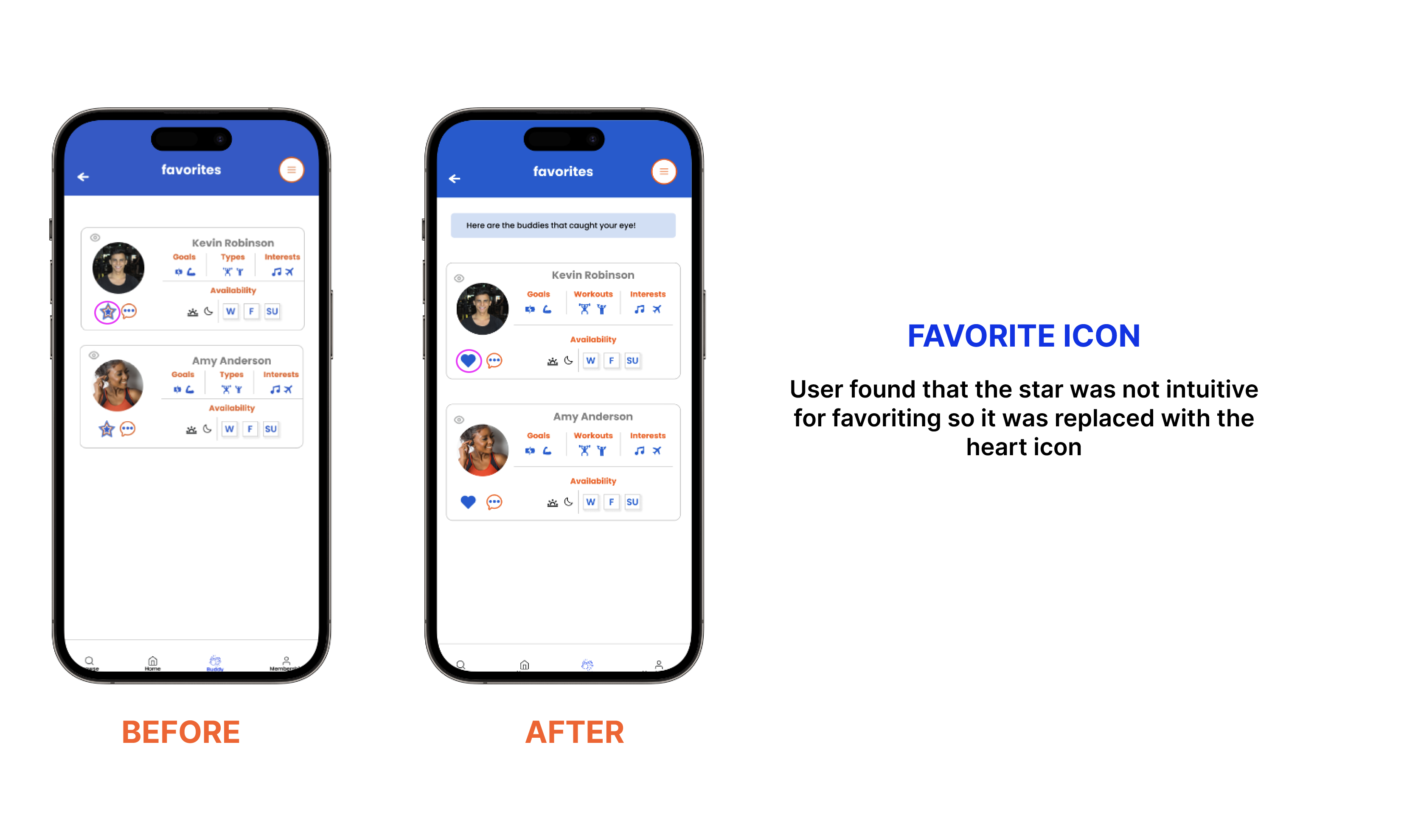
  • Favoriting Icon: Users found that the star icon was not intuitive for favoriting, so it was replaced with the heart icon.
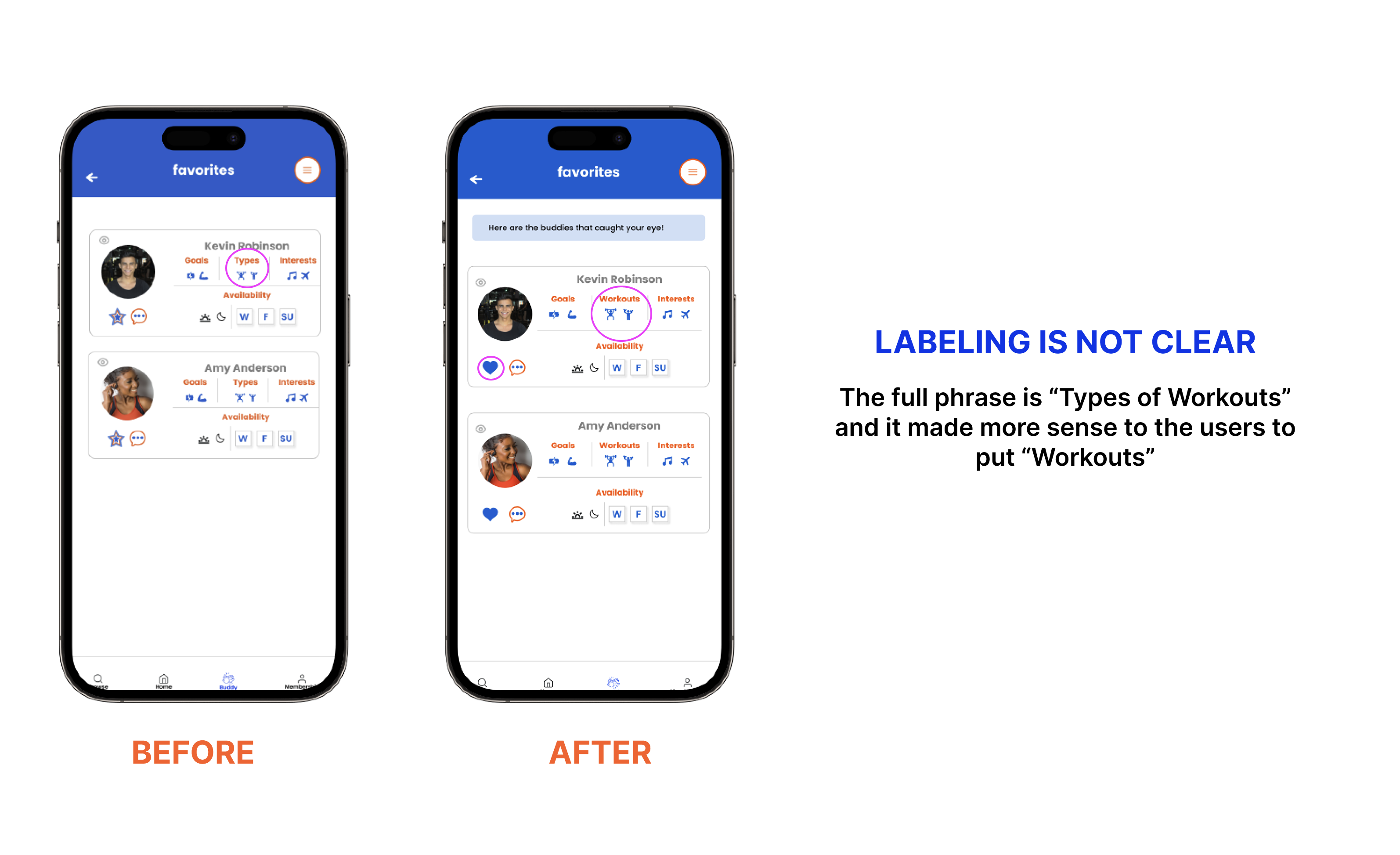
  • Label for Workouts: The full phrase "Types of Workouts" was modified to simply "Workouts" as it made more sense to the users.
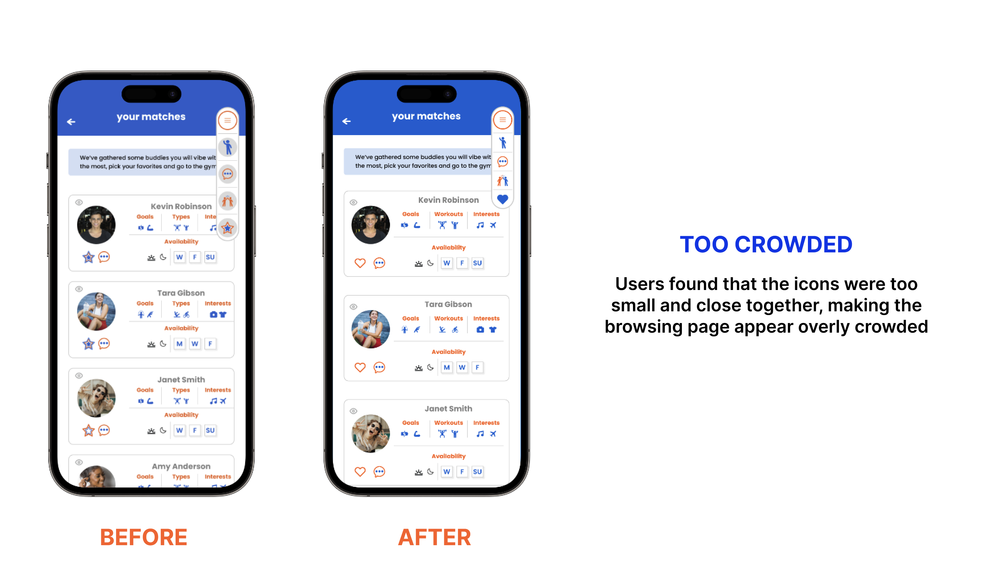
  • Icon Size and Spacing: Users found that the icons were too small and close together, making the browsing page appear overly crowded.

What I learned

Throughout the project, I developed my collaboration skills as a UX designer and learned to work effectively with my team to achieve a shared vision that incorporates diverse perspectives and individual strengths. I also emphasized the importance of prioritizing user needs and accessibility, while adhering to BLINK's established design system. Additionally, I demonstrated a commitment to iteration and advocated for user-centric solutions throughout the project.

Be approachable

Be flexible

Listen and empathize

Thank you